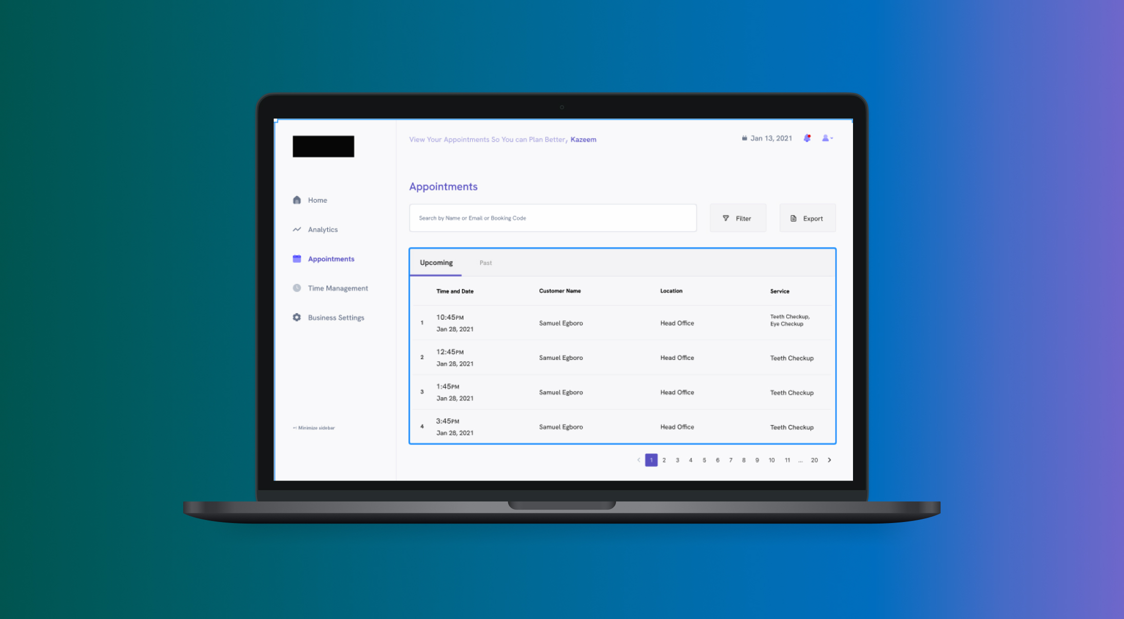
I worked as a contract Designer in a group including web and mobile developers.
SaaS
Enable businesses to create a schedule for their staff where their services can be booked.

Visiting the hospital can be very stressful and that is the last thing that you want to feel when you are not as strong as you usually are or not in a good mood. Booking an appointment for the service you want ensures you avoid that waiting line and get the help as soon as possible. That’s just one use case of this application, imagine this replicated to your favorite saloon, nail care business, now that's the power of what we built here.
I took over the project when it was halfway done and as such I worked on a part of the mobile app and everything on the dashboard of the whole system. (Only going to show the bits I worked on here). To kickoff, I had several calls with the major product stakeholder to better understand the problem and the business flow. This gave me a sense of the path they had been on and how I can help them achieve the goal of the project.
Simply put, I am creating a scheduling system for businesses that have outlets, several services and many staff hierarchies considering many use cases of time constraints.
Using the principles that guides Lean UX: Think, Make and Check
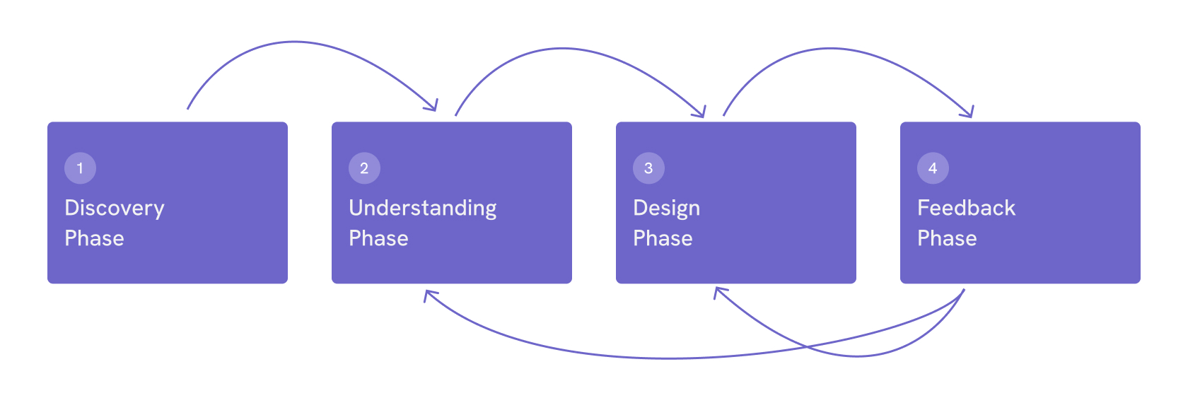
In this phase, I had a call with the product owner to understand what they are doing and also what they have learnt in the past.
After getting an idea of what the product should do, I created an IA flow to further explain what the product could look like and followed with some rough sketches of some important screens.
Using the wireframes and my understanding of the product, I went ahead to create HiFi mockups of the product.
This phase intersected the design and understanding phase continuously through my work on the project. This was done with an existing business that fit the product use case.
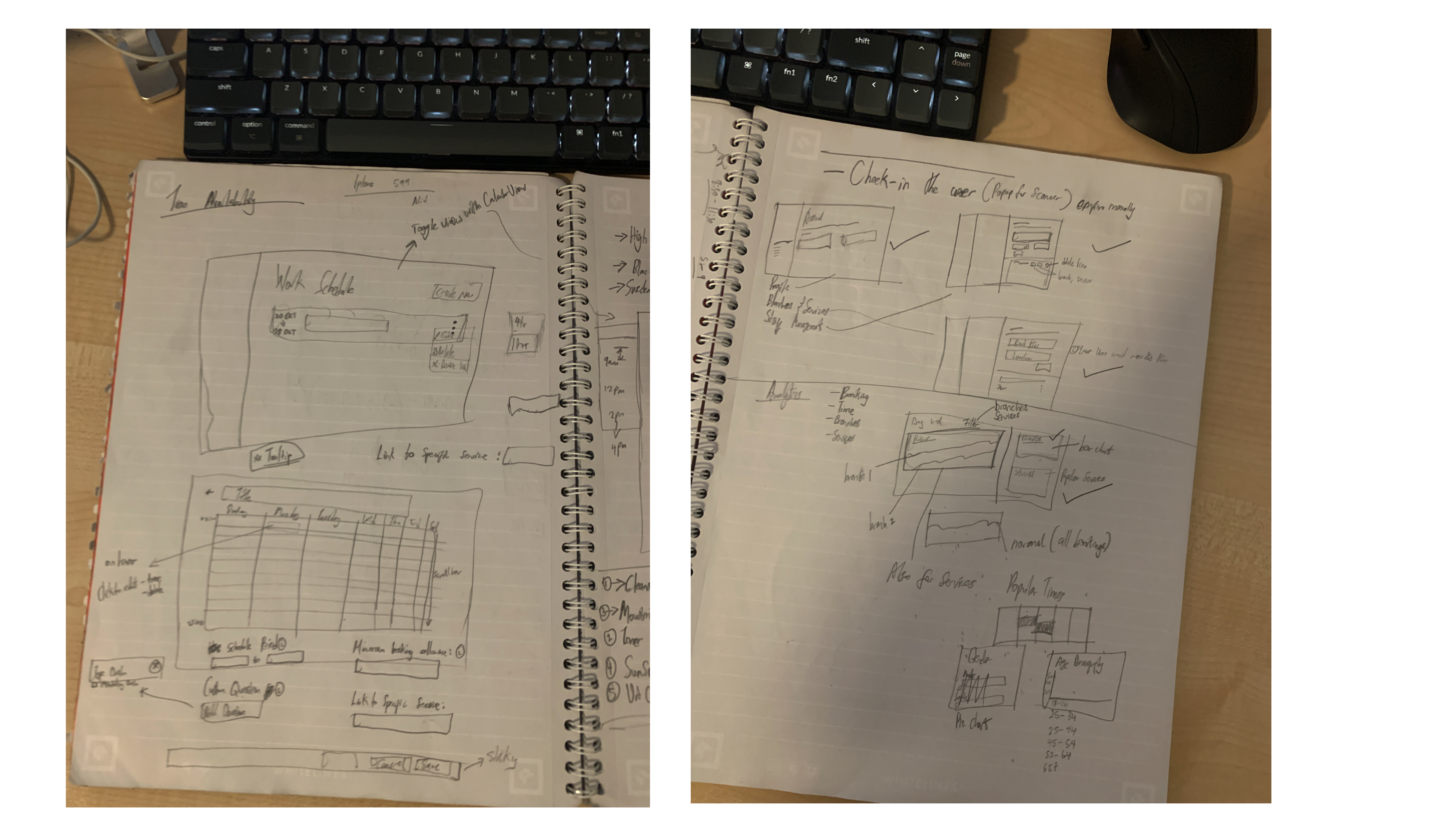
A rough depection of what was going on in my head to visaulize what the screens could look like.
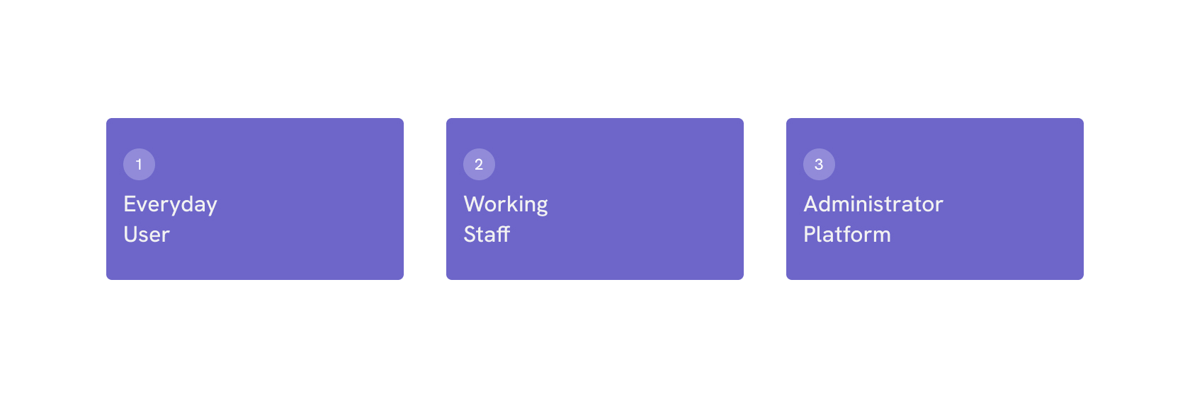
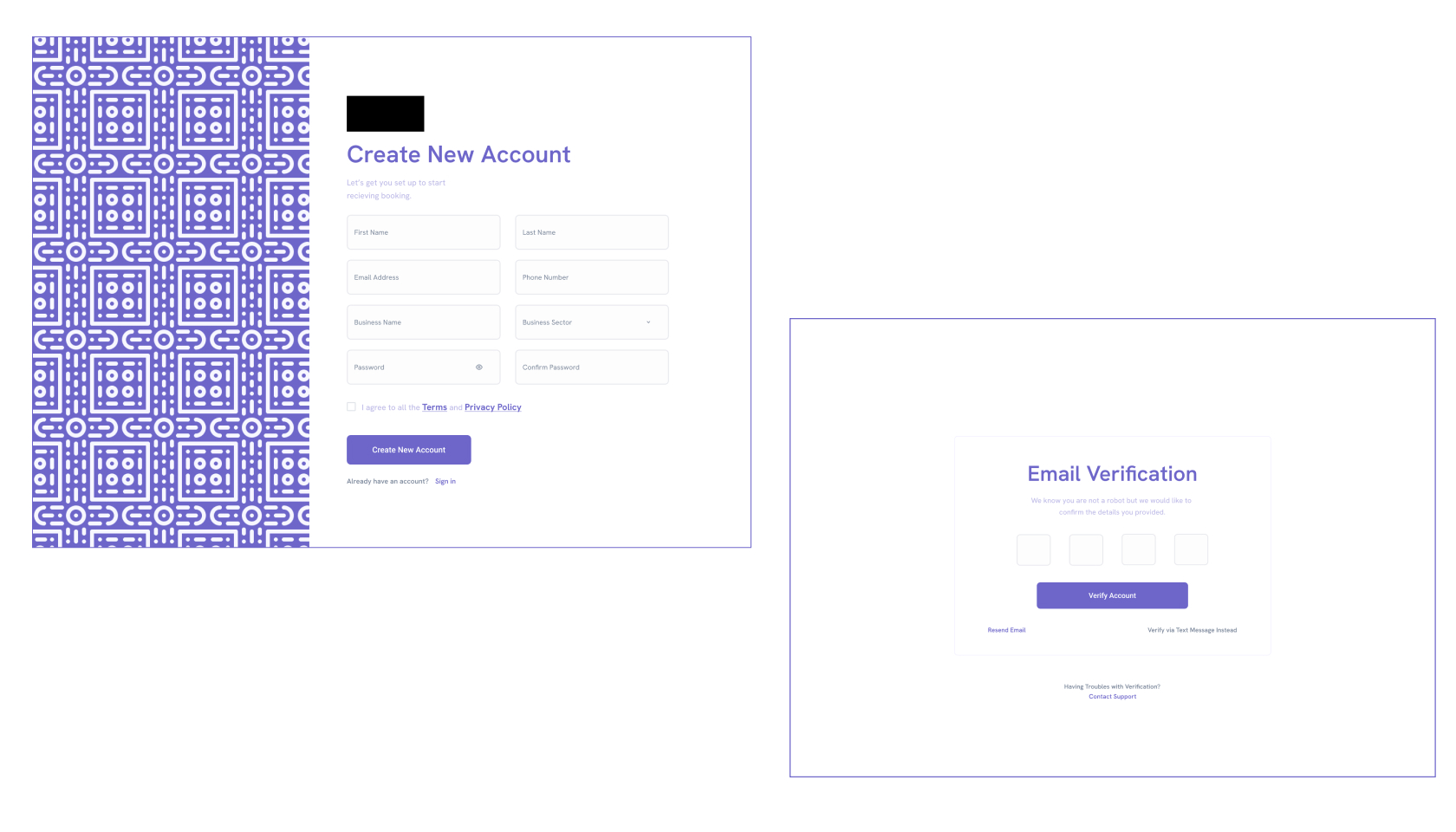
Accounts were created after being added to the platform by the administrator.The Administrator is also responsible for setting your permissions as different staff saw different views according to their daily tasks.
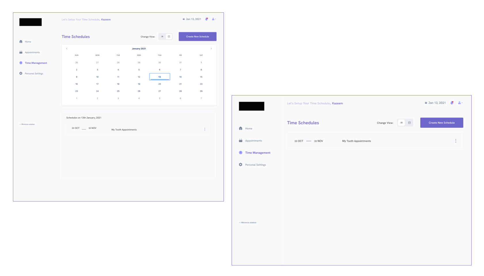
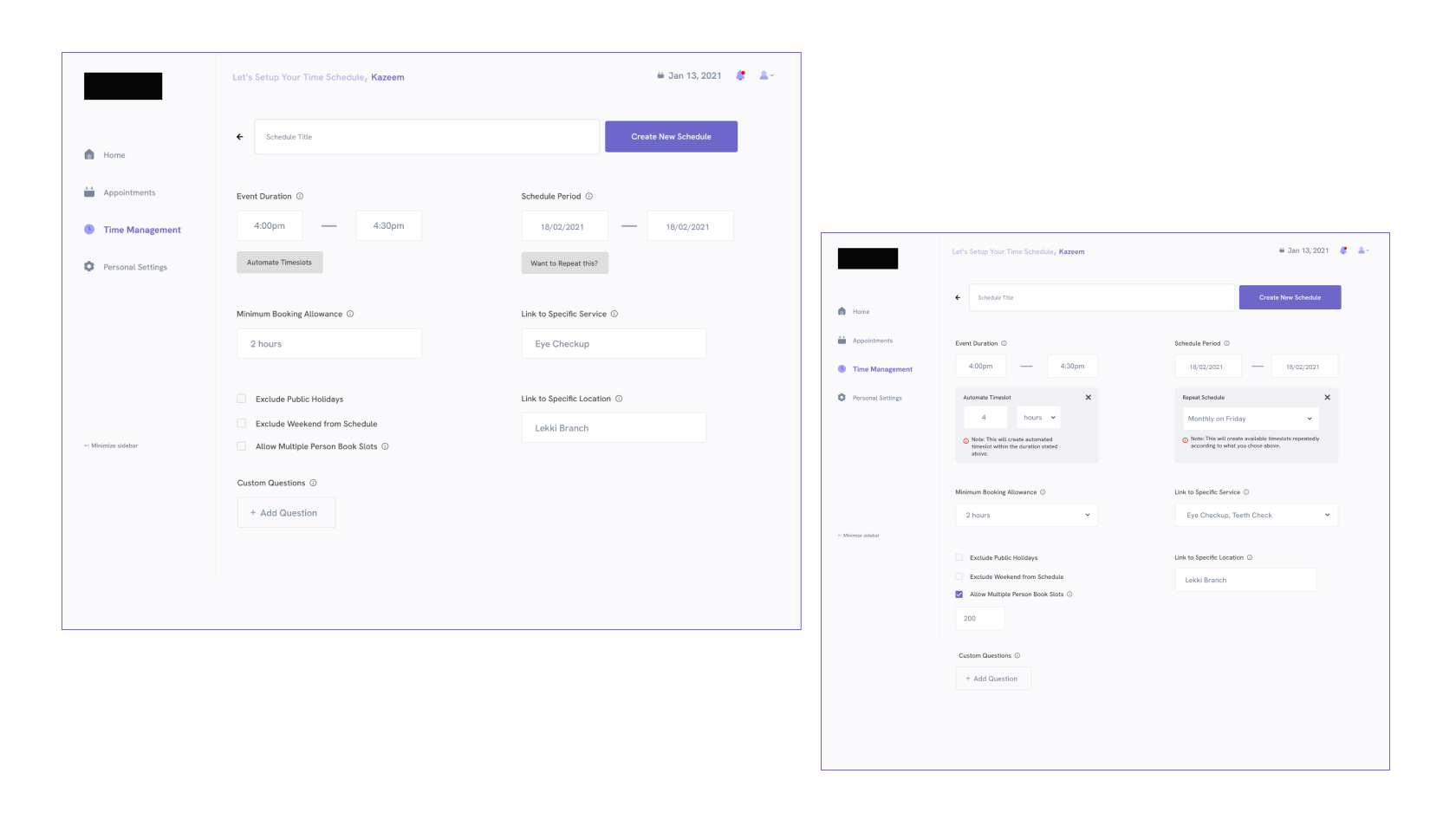
For Staff that handled services, they can set up their calendar so the general users can book slots which are directly connected with services and branches.
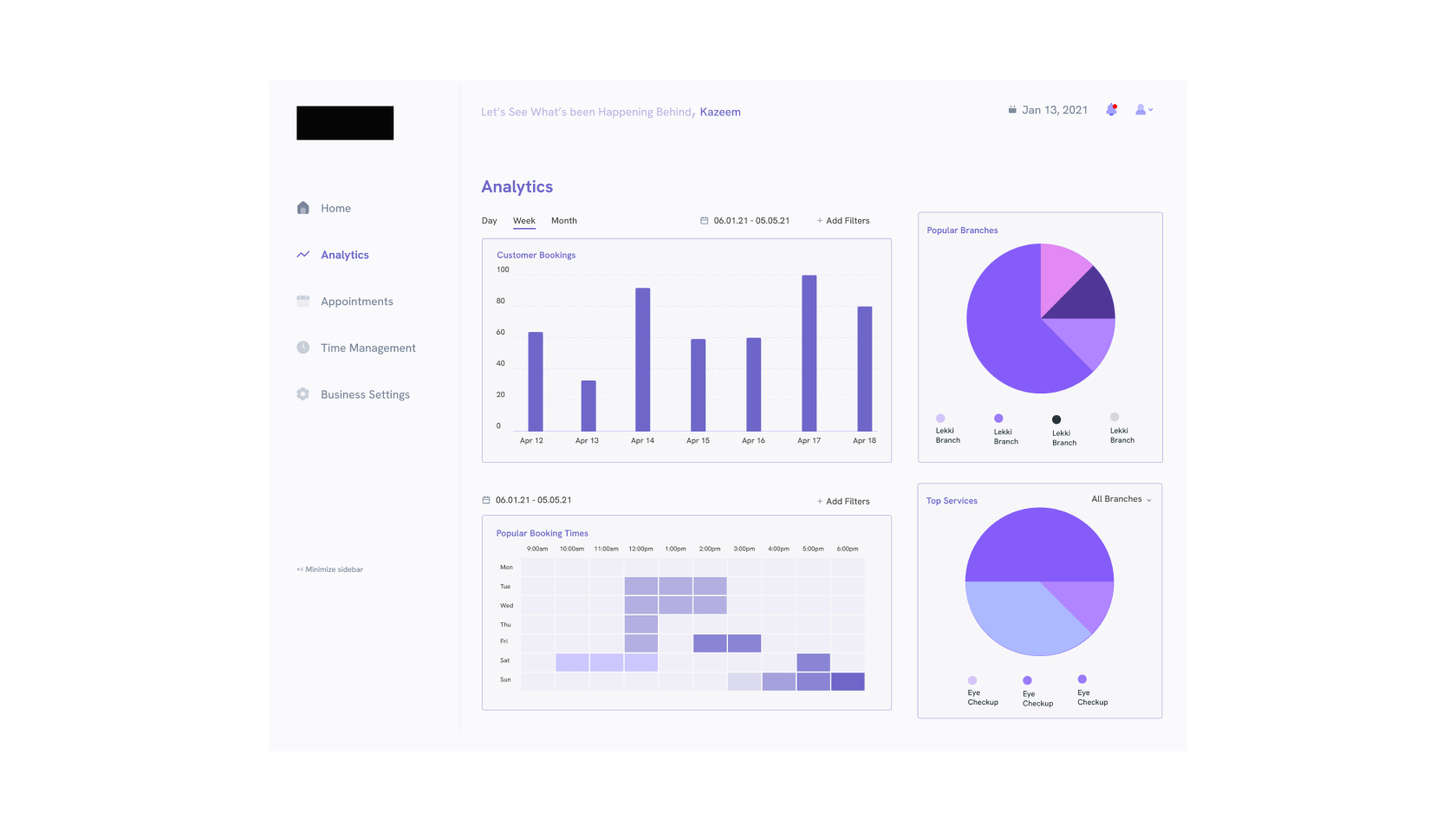
The administrator could see a highlight of what was happening across branches,services and in the company generally.
The administrator settings served as a mini powerhouse that allowed access to add new services, branches and staff.
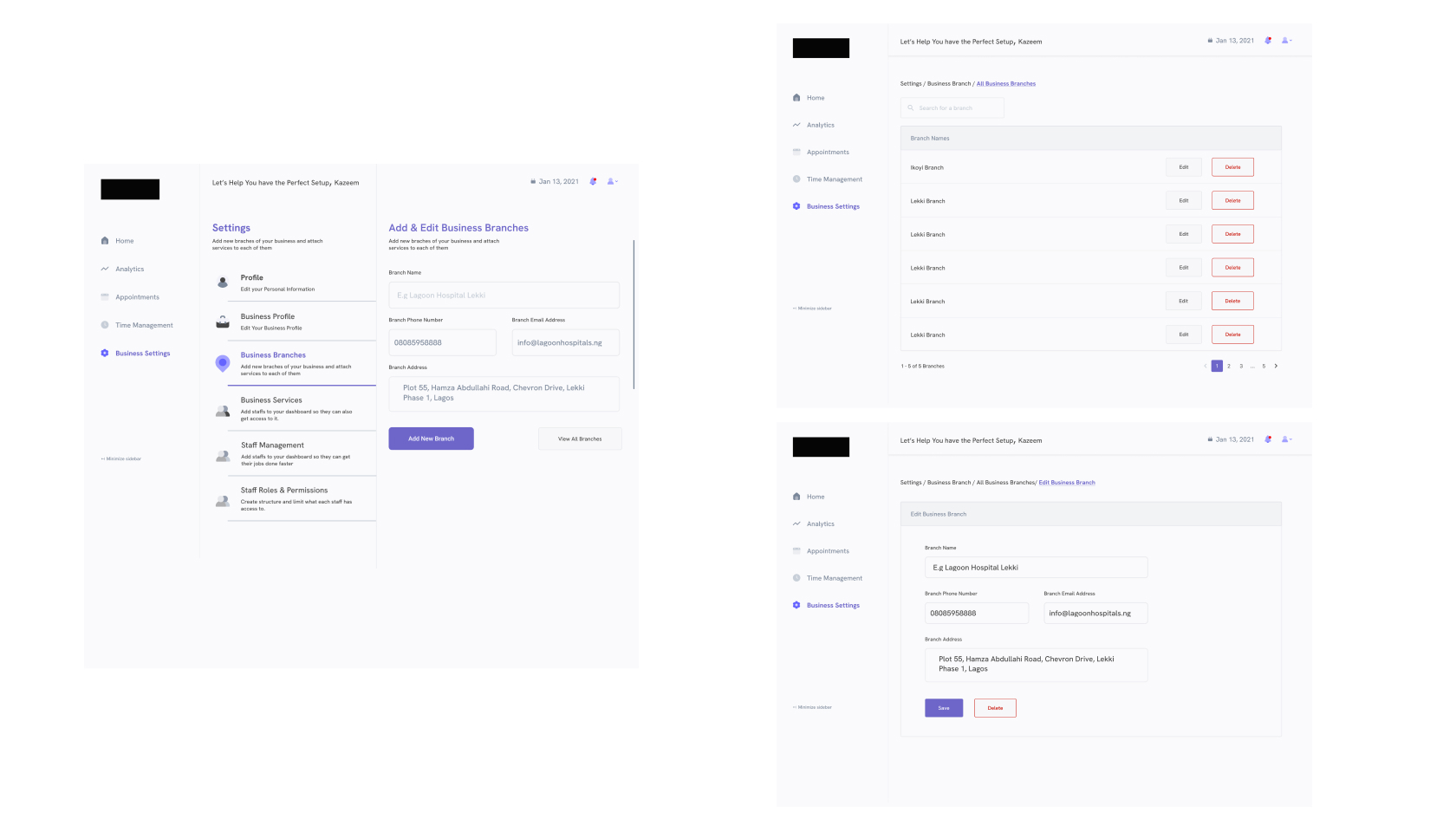
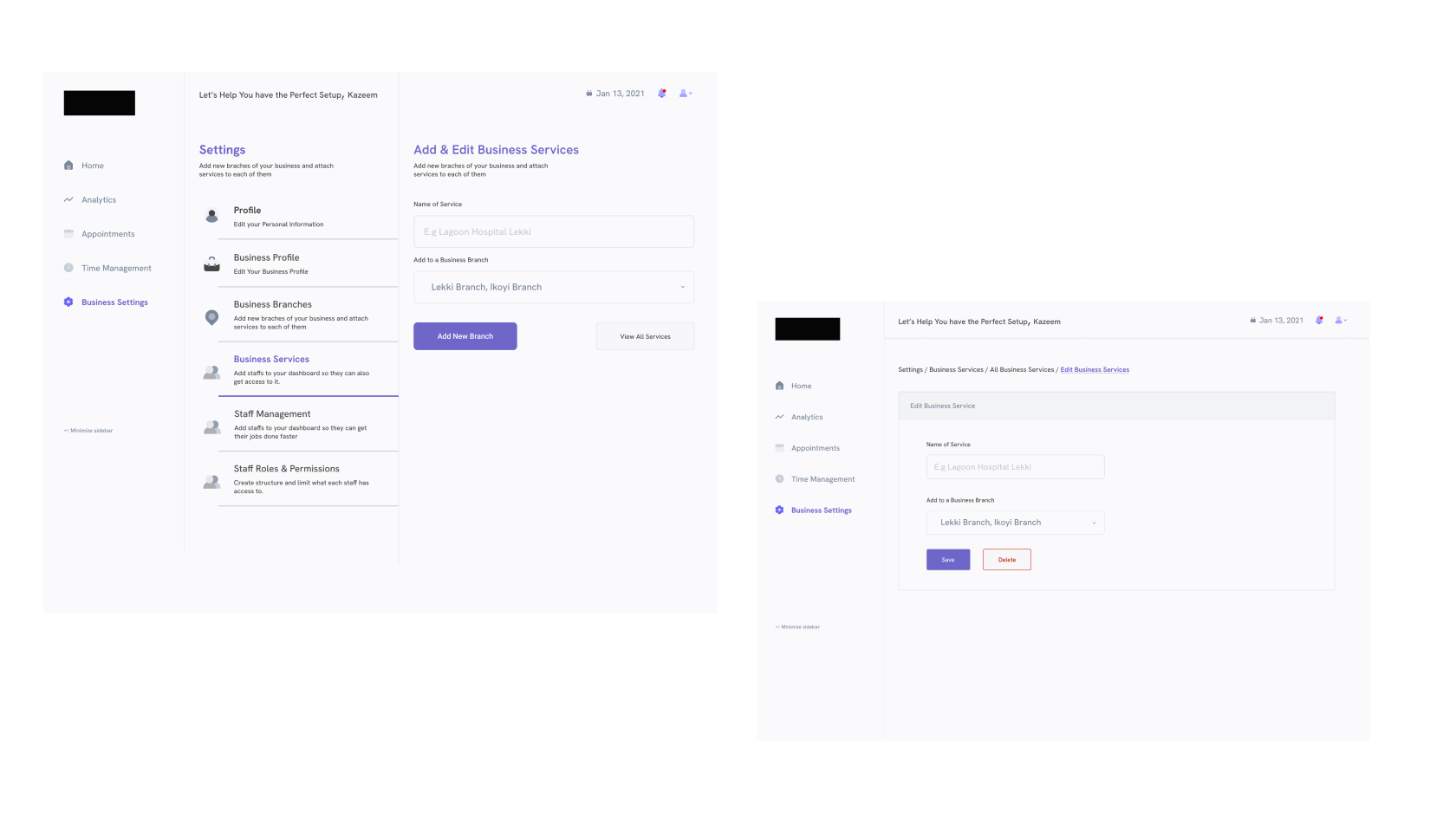
During the design of the Appointment page of the staff, we were in conversations with a hospital where we were able to test the screen, asking questions and getting feedback and the final screen is the one attached above.
One differentiating feature with this application was the fact that all outlets/branches were connected to each other and you could see the different services each branch had. As development is never done, work is still being done as we learn lessons directly from the users.